Metalarte marks the tenth anniversary of Josephine, designed by Jaime Hayón, with a Limited Edition
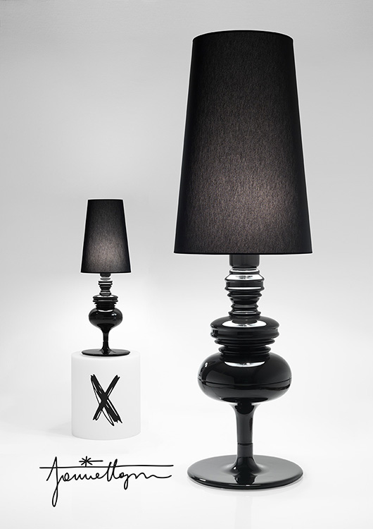
Josephine turns ten years old. Jaime Hayon started out in lighting design with Metalarte in 2005 with this piece, which was destined to become a classic.

It was a return to sophistication and to an appreciation of things that are well made. It was a bet placed on democratic luxury, which brought back good, old-fashioned silver and gold for decoration, with the impeccable manufacture of Bosa fine ceramics, the perfect example of modern craftsmanship. Since then we have seen different versions of this light fixture for tables, for walls, and for the ceiling, including a magnificent chandelier.
The floor lamp was missing, because we were saving it to celebrate its anniversary. The new Josephine X has grown spectacularly in size and also comes in a commemorative Limited Edition of 10 colours, with only 10 numbered and signed units produced in each colour.
These are the colours that have made Hayon's career successful for a decade:
Azul mediterráneo. The importance of the Mediterranean and the choice to live near it. First in Barcelona, the place where the light fixture was born after returning from Italy, and then later in Valencia. A lifestyle and a great deal of energy in Josephine's origins.
Celadón imperial. The discovery of porcelain in a first visit to China. A blue that is very typical of those ceramics, which have a tradition of thousands of years.
Mango tropical. Summer visits and the tropical influence. The importance of colour and humour in life.
Bordeaux français. The French inspiration and a taste for sophistication. The noble colour that is never missing in a palace.
Danish pine green. The green of Danish pines. The influence of Scandinavian design in the evolution of his work, from 2005 until now.
Dutch clay. The Dutch contribution, on the level of culture in general and of Nienke in particular, reflected in the artistic management work that she does along with him. Josephine was born when they met, and is their first important product.
Gris lava Lanzarote. The impact of seeing Lanzarote and its volcanic land. Manrique and the source of inspiration that the island has been. Nice, relaxing moments for creation.
Azul Okura. The colour that is associated with their favourite hotel in Tokyo. The colour of kimonos and of the everyday. A very special colour, because it represents what is noble in Japan.
Pink bunny. It is a nod to beginnings. The portrait of him dressed up as a pink bunny came out publicly at about the same time as the light fixture appeared.
Crema Brancusi. Homage to Brancusi and to form. The important work in volume that is also everything in this design.


Information & images by courtesy of Metalarte
Read more news related Metalarte published at Infurma
Read more news related Jaime Hayon published at Infurma
Visit the Metalarte website
News Infurma:
Online Magazine of the International Habitat Portal. Design, Contract, Interior Design, Furniture, Lighting and Decoration