Freshperts by Sandra Tarruella Interioristas. Different proposals in the same space

Sara Serantes and Sergi Zacharias, founders of Sushifresh, commissioned Sandra Tarruella interior design studio to design the premises of their new brand: Freshperts that includes five varieties of food to deliver. The studio explain us the development,
With the brand's new expansion plan, visibility issues and understanding of the premises are solved, as well as both the operations and organization that had developed and that had an impact on the design of the spaces.
Transmit the essence and values of the brand
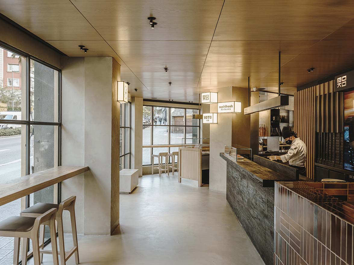
The objective of this renovation, located on the north side of the city, was to transmit the essence and values of the brand. Also, that customers and delivery people recognize the different restaurants that are situated within the premises. Different kitchens are visible, and have an aesthetic according to the type of food they are preparing, promoting transparency in the use of good raw materials and with the intention that the customer is more involved in the creation process.
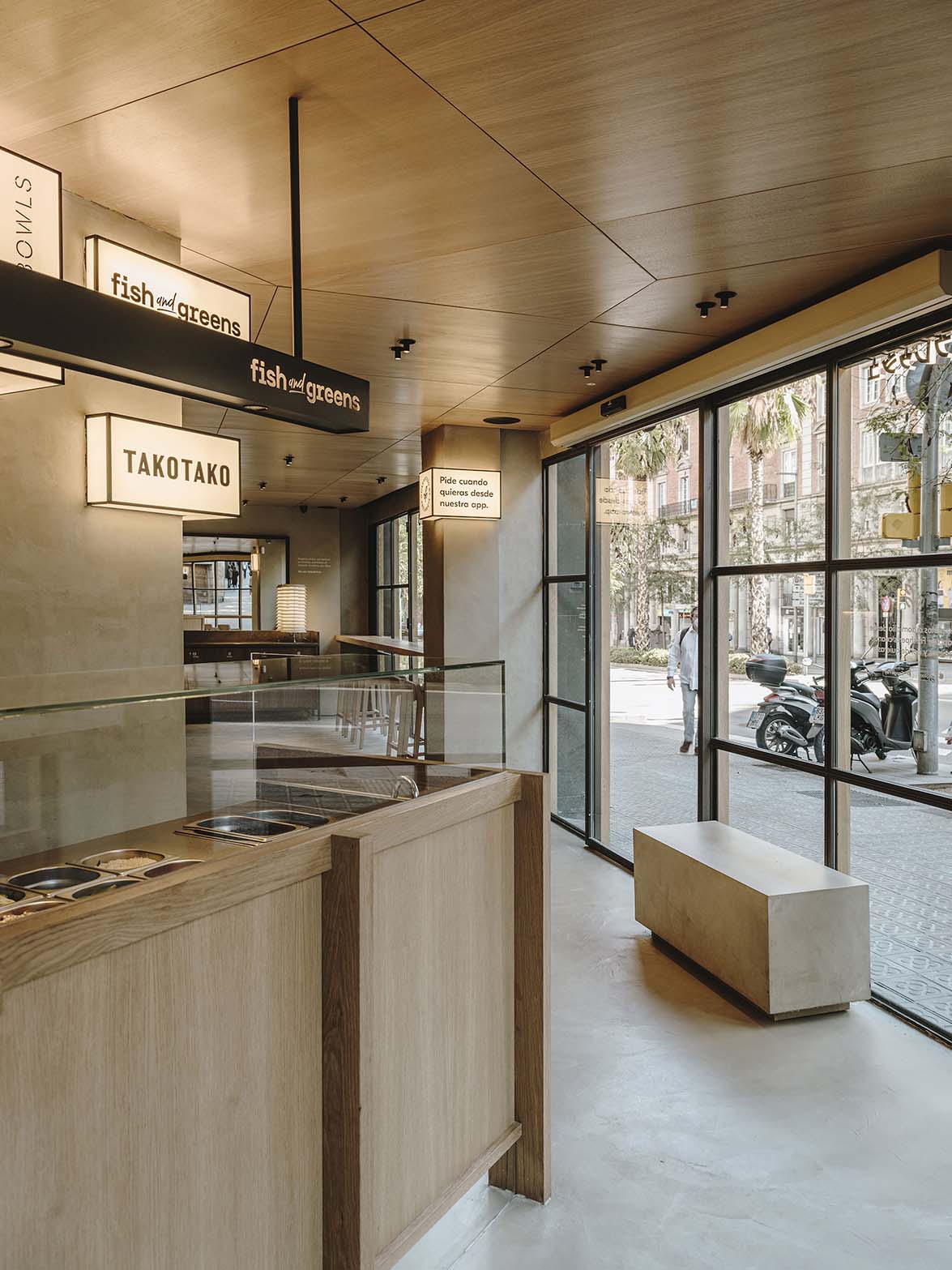
The corner shop has an irregular shape with two large glass facades with existing raw steel panels. It was decided to reuse these frames and cover them with vertical timber slats to eliminate the coldness of the raw steel with wood and visually lengthen its low height.
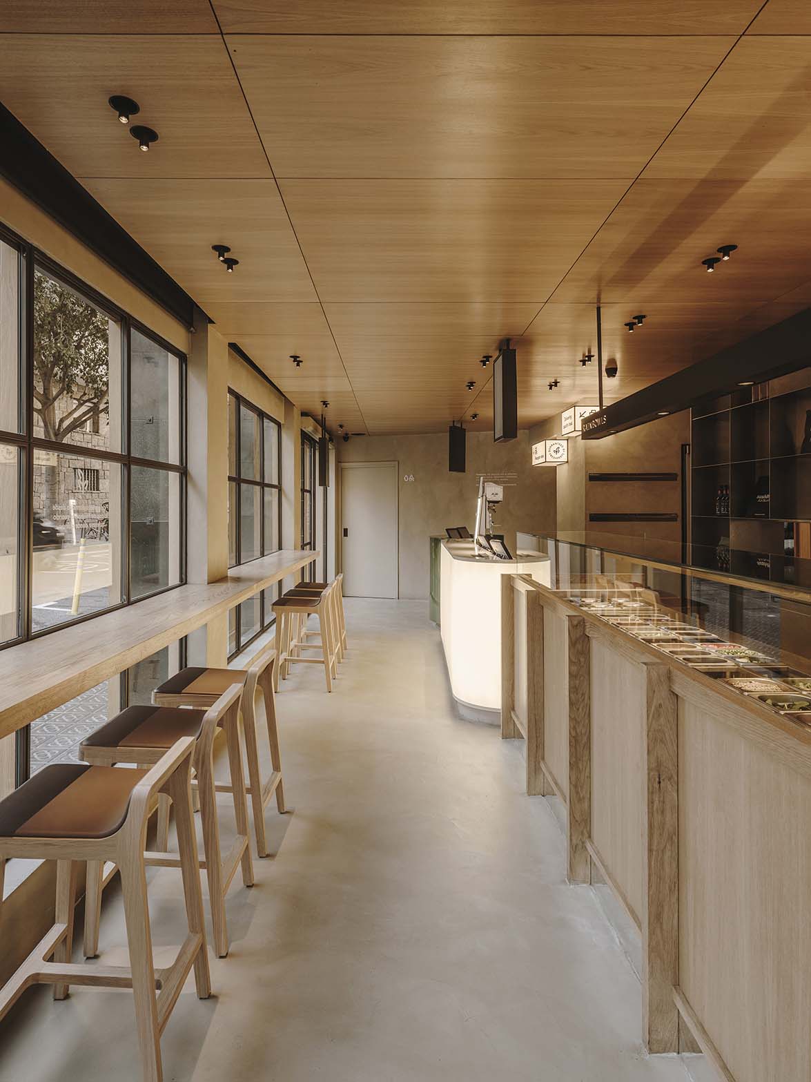
Considering the different functional and experiential needs, we came up with the idea of designing a common space with warm oak wood ceilings and microcement floors and walls facing the visible kitchens. The wall behind the cooks is finished with vertical wooden slats and apart from hiding the facilities. It integrates working spaces, as well as washing and storage spaces. This wall also includes details such as a custom raw steel cabinetry that storages and displays the packaging boxes to ease the work of the cooks, and each area is painted with its corporate color to quickly identify them within the overall finish. 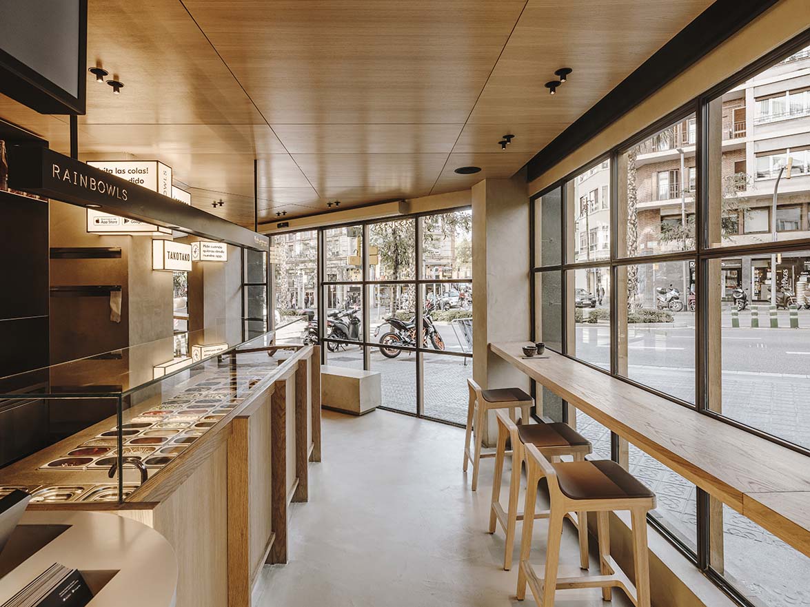
Use of noble materials
The circulations among cooks, delivery personnel, and customers are resolved by opening two independent entrances. One for the delivery personnel to collect the orders behind the counters of the different kitchens, and a separate entrance for customers.
We worked with noble materials, including wood, stone and raw steel. All in combination with volumes and refined shapes to achieve a functional aesthetic, yet without unnecessary additions or decorations.
The functionality and operations offood preparation was optimized, and a custom dividing shelf was designed to separate the hot kitchen area from the rest of the open kitchens.
This stainless-steel counter is the central axis of the premises. It serves to place all the orders that are waiting to bedelivered, and special drawers are designed, that are thermally insulated, to keep the food warm before it's being delivered.
Different concepts
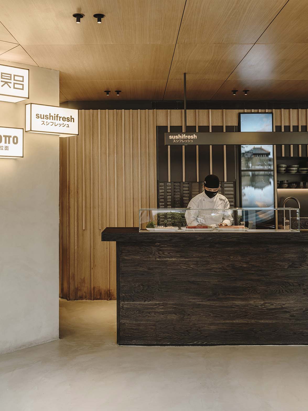
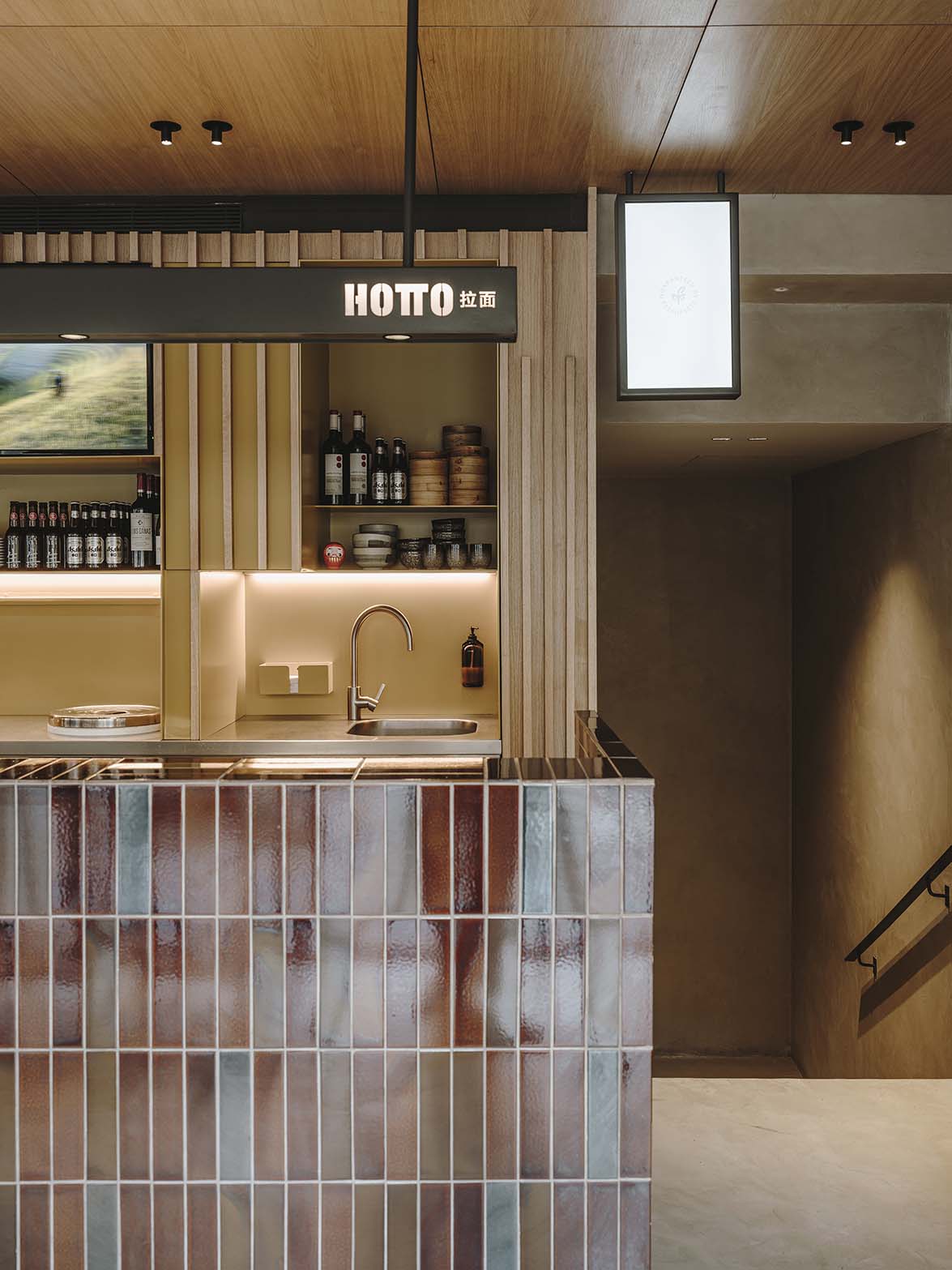
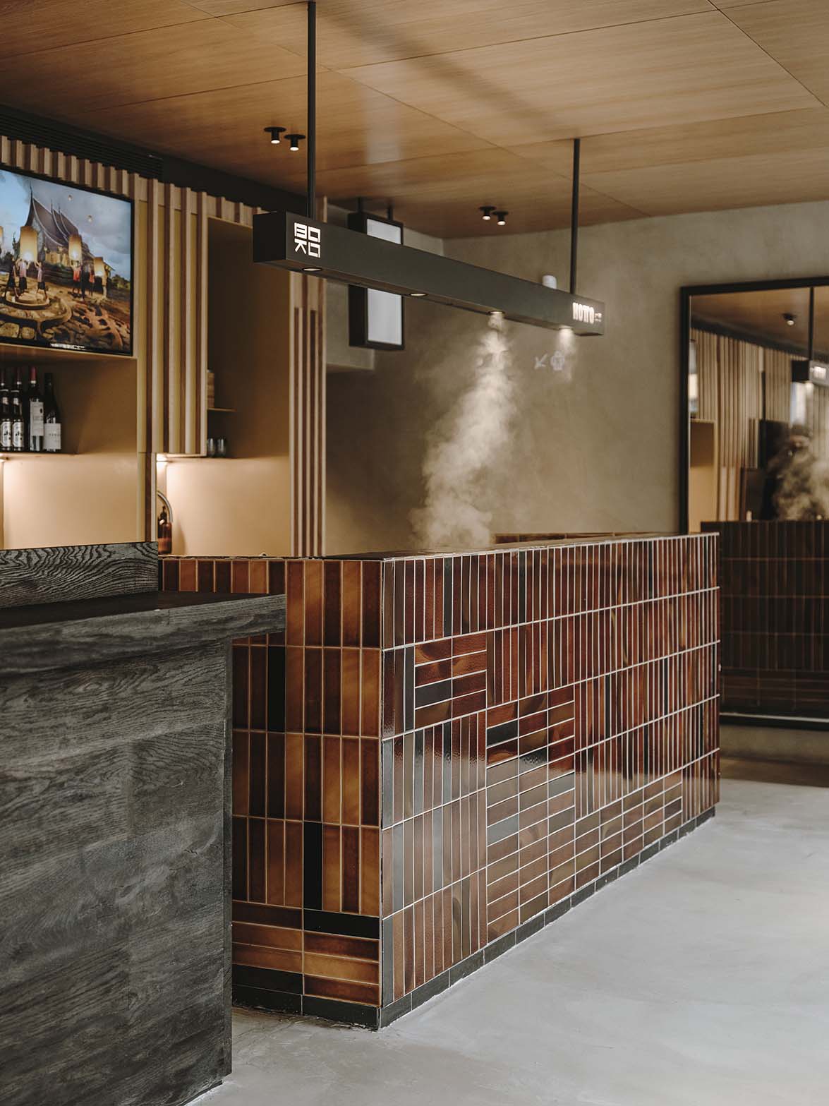
Upon entering the premises, the most visible counter belongs to Sushifresh, which is made of solid wood and stained in a black tone. Next to it, there is an Asian-inspired Boko Hotto custom furniture piece made with handmade tiles that cover it fully, using different warm tones, including terracotta, caramel and browns with a 1970s inspiration.
In the middle of the premises, the Fish & greens and Rainbowls counter is located. It offers vegetarian food. Here we decided to design it with a fresher and more youthful aesthetic, and made in natural oak wood.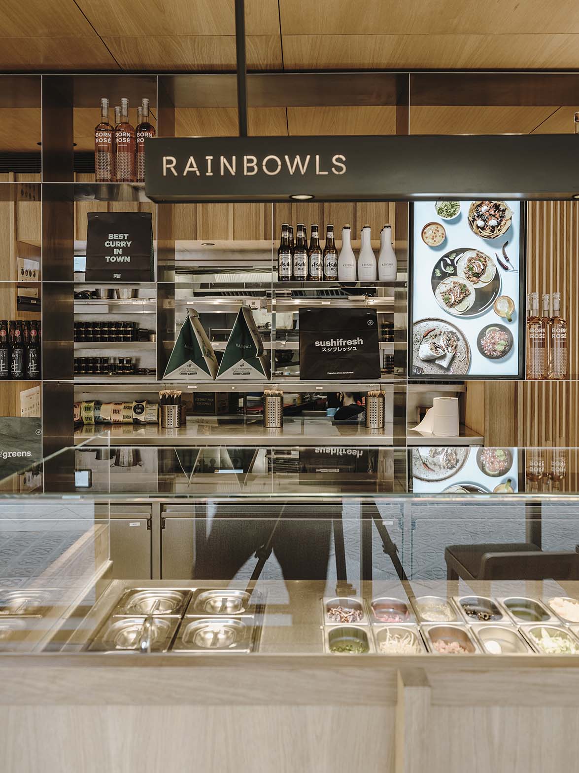

The dynamism and versatility of the counters is complemented with a cylindrical green lacquered counter for delivery personnel to collect orders.
Next to it, the cashier and drinks counter is located. It is made with a translucent fabric that allows the light panels to backlight it, becoming a visible attraction from across the street.
The study of light
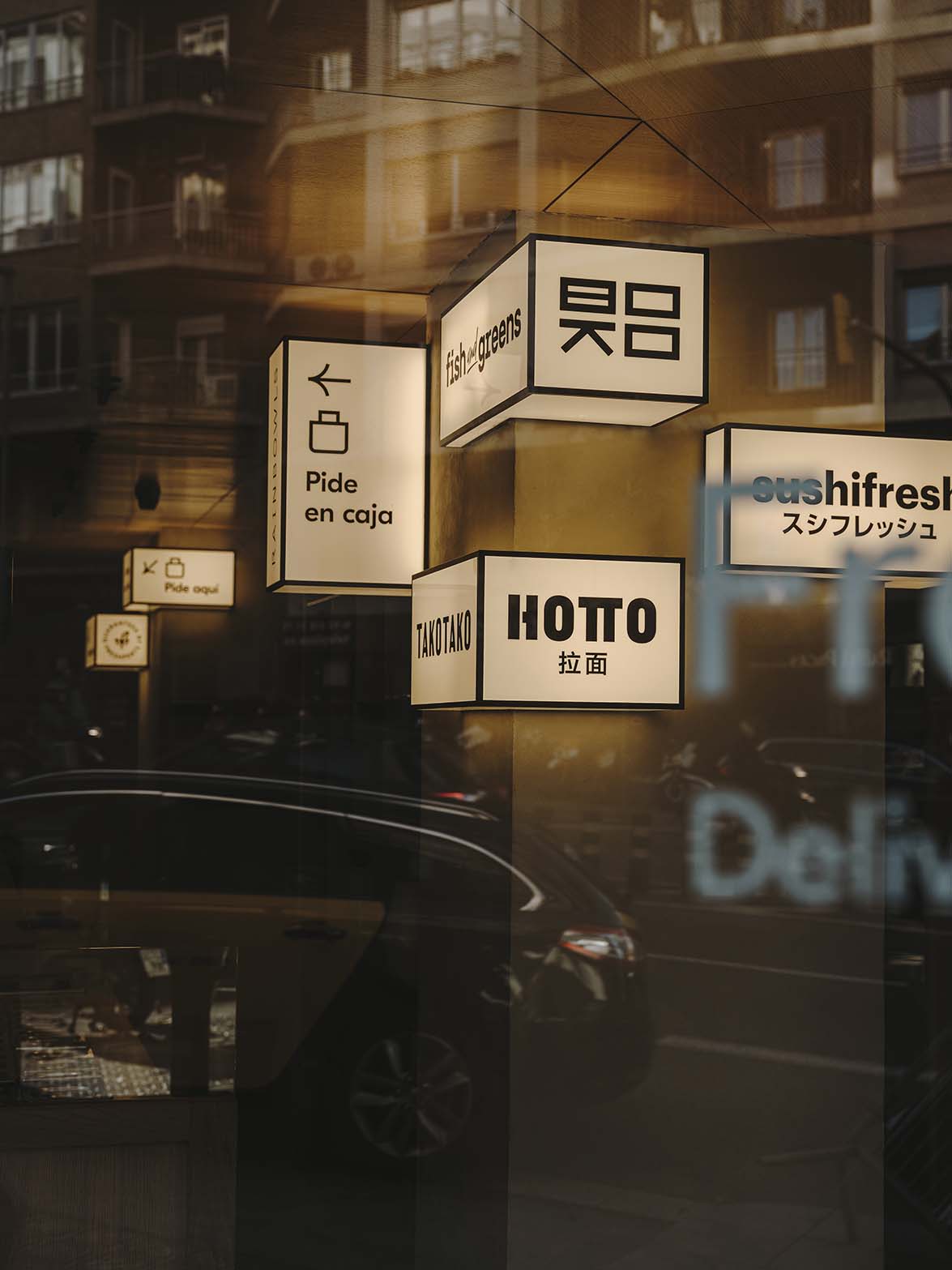
The study of light was very important to provide a night scene and enigmatic atmosphere. With the aim of diverting attention from the large columns that are in the center of the premises, we decided to decorate them with asymmetrical light boxes that are inspired by large cities in Asian countries. They serve as a communication support, helping the customers to have a better experiencein the space.
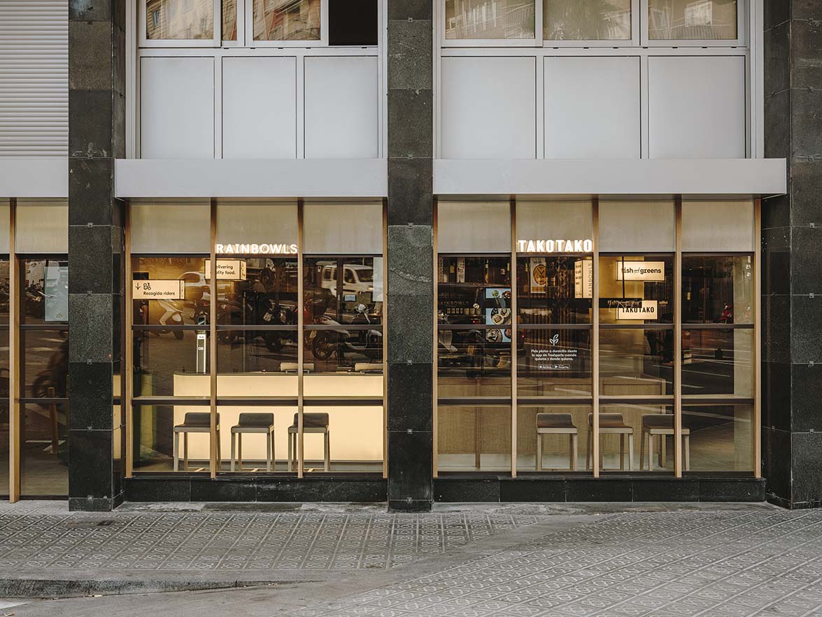
The signage of the different restaurants on the façade was also taken care of. Each one, with its brand seal turned into cut-out letters that emit light, and are placed across the façade. They attract the attention of passersby, blurring the separation between the exterior and interior space. 
Creative Director: Sandra Tarruella
Project Leader: Elsa Noms
Collaborators: Mariona Guàrdia, Núria Martinez, Anna Torndelacreu, Adriana Camps
Photography: Salva López
Source: Sandra Tarruella Interioristas
Read more news related Sandra Tarruella published at Infurma
Visit the Sandra Tarruella Interioristas website
News Infurma:
Online Magazine of the International Habitat Portal. Design, Contract, Interior Design, Furniture, Lighting and Decoration