Jotun released 2018 color map for interiors at Formex Stockholm
Color is in the spotlight at this fall's Formex, both in terms of concrete color scales and the idea itself of how colors can affect us as people. Norwegian color manufacturer Jotun released its 2018 color map exclusively during recently closed Formex. Trends in interior design.
“It is unbelievably fun. People have long held the belief that color is something technical and masculine and that it is for something other than interiors. This belief is completely wrong, and this exhibition shown that,” says Lisbeth Larsen, Global Color Manager at Jotun.
Together with Kråkvik & D’Orazio - the Oslo based styling studio under the management of Alessandro D’Orazio and Jannicke Kråkvik, who many visitors may recognize from earlier Jotun collaborations - Jotun designed for the first time in Formex history a main exhibition around the concept of color.
“It is our view that color has changed over the course of just one generation,” says Lisbeth Larsen, who emphasizes that Jotun has never named a “color of the year”. She takes the position that this is an empty gesture. What she would instead like to achieve is a deeper discussion about how we can construct worlds - large and small - that create a context and help us feel at home.
“Before, we usually fielded questions like ‘What is the current trend?’ or ‘What should I do at home?’”. Today, we get specific questions about which tones promote the best sleep quality. The level of interest today, as well as the level of knowledge, is completely different. People don’t follow the herd, which I think is wonderful.”
Jotun's exhibition at Formex revolved around three basic palettes - each of which is rooted in different ways to relate to a faster and more uncertain time.
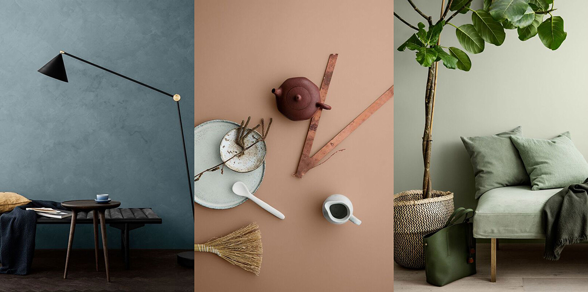
→The first palette is industrial grayblue and has the scent of uncluttered urbanism. “All over the world, we are seeing a tendency to want to shrink our contexts. Fewer square meters, smaller finances, less vulnerability. A city like Berlin has long served as a clear example of how we are looking for smaller homes, not infrequently in industrial buildings, and this mentality is now spreading.”
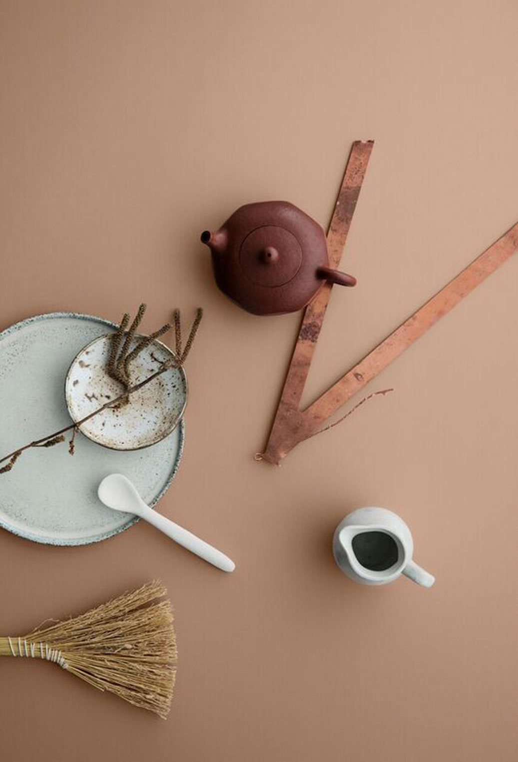
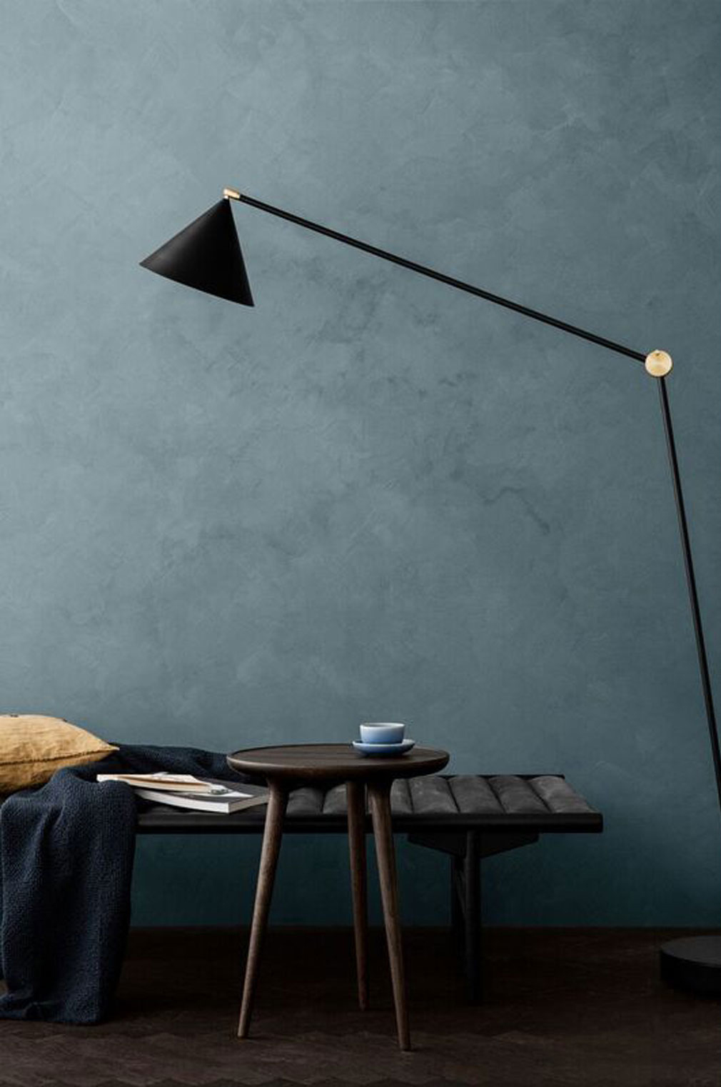 →The second palette revolved around sun-bleached colors, broken tones and horizons. Colors for a culture which, in Lisbeth Larsen's words, wants to let go. “It has become a luxury not to be connected, and there is a widespread desire to live a quieter life. This is where color comes in, with a large number of careful nuances in the greenbrown spectrum. I believe they will become more dominant in Scandinavian design.”
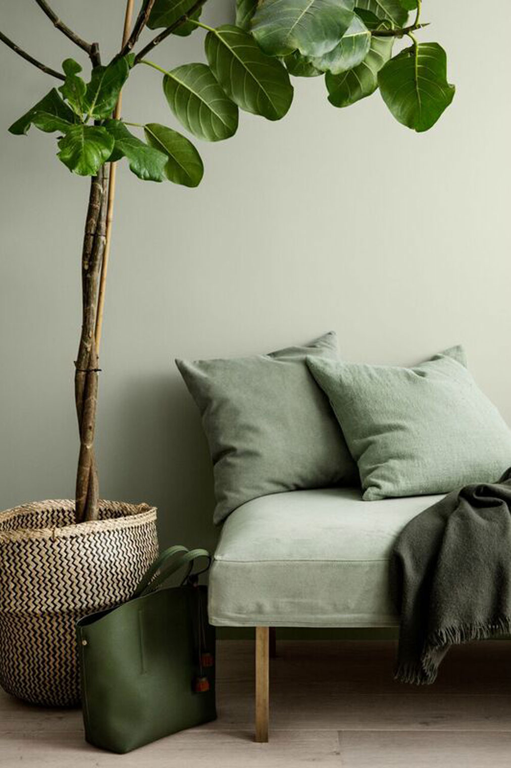
 →The third palette is slightly more cryptic. Botanical gardens and Indochina, bluegreen seas and colorful flowers. “These colors are for those who like things to be a little lusher,” laughs Lisbeth Larsen.
Finally, what is next on your schedule?
“I will be traveling to a small village in Vietnam to work with architects in Southeast Asia and talk about colors in an exterior context for 2019. We like to be forward-looking in our industry, but this is also what makes it so much fun!”
Source: Formex
Visit the Formex website
Read more news related Formex published at Infurma
Visit the “Fairs & Events” Calendar in Infurma
News Infurma:
Online Magazine of the International Habitat Portal. Design, Contract, Interior Design, Furniture, Lighting and Decoration